KINTO’s TRAVEL TUMBLER is a tumbler for people who lead a flexible but conscious lifestyle.
Since its release in 2017, it has quickly become one of KINTO’s signature items, adding new colors and sizes along the way.
We asked TRAVEL TUMBLER product designer Shin Azumi about the source of his inspiration and the thought process that followed.
Since its release in 2017, it has quickly become one of KINTO’s signature items, adding new colors and sizes along the way.
We asked TRAVEL TUMBLER product designer Shin Azumi about the source of his inspiration and the thought process that followed.
- What was your impression after the initial brief?
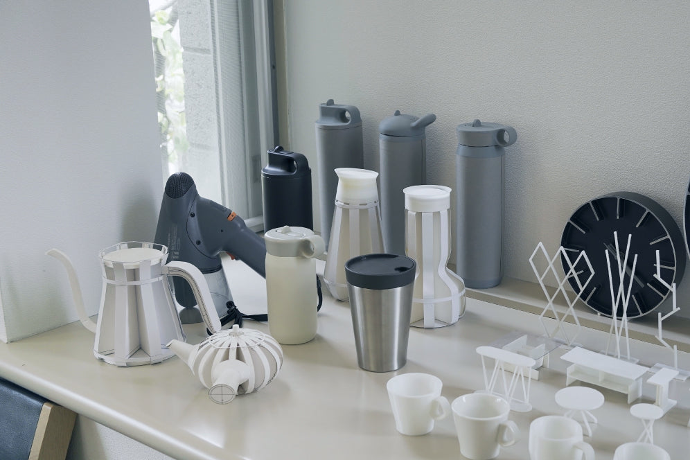
I remember it was my first project after returning from London. At the time I was very keen to try something I could only do in Japan, or something Japan was not very good at. The idea of designing a vacuum-insulated stainless steel bottle definitely captured my interest, because the resin and stainless steel would need to be shaped and fitted very carefully. As a designer I tend to obsess over screws and structures, and I felt this project would be a good challenge in that respect, too.
I remember it was my first project after returning from London. At the time I was very keen to try something I could only do in Japan, or something Japan was not very good at. The idea of designing a vacuum-insulated stainless steel bottle definitely captured my interest, because the resin and stainless steel would need to be shaped and fitted very carefully. As a designer I tend to obsess over screws and structures, and I felt this project would be a good challenge in that respect, too.
- What was your source of inspiration for the TRAVEL TUMBLER design?
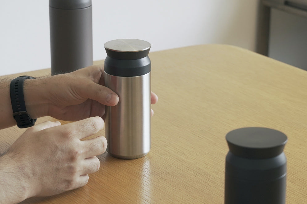
There was this expectation both in Europe and in Japan that objects we touch should be curvy and friendly-looking, but I wanted to prove that a stylish design could be just as easy to use. I wondered if I could break free from the “straight lines = industrial” formula and create a linear design that was both dignified and elegant. I eventually found my inspiration in a milk can. Traditional milk cans have a linear shape because they are made by rolling a sheet of metal, and this matter-of-factness appealed to me. With modern technology we can pretty much create any shape we want, but I felt it was time to revisit the dignity of simple forms.
There was this expectation both in Europe and in Japan that objects we touch should be curvy and friendly-looking, but I wanted to prove that a stylish design could be just as easy to use. I wondered if I could break free from the “straight lines = industrial” formula and create a linear design that was both dignified and elegant. I eventually found my inspiration in a milk can. Traditional milk cans have a linear shape because they are made by rolling a sheet of metal, and this matter-of-factness appealed to me. With modern technology we can pretty much create any shape we want, but I felt it was time to revisit the dignity of simple forms.
- How did you design the details?
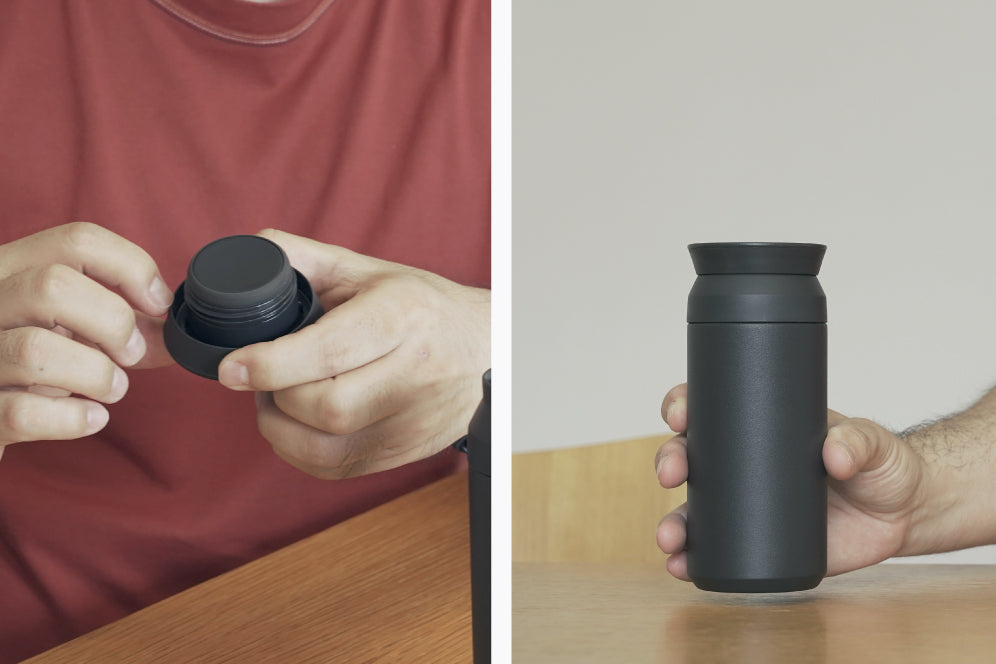
The TRAVEL TUMBLER is made up of simple lines but every detail, such as the placement and angle of the dimple, is intentional. Take the lid for example. How sharp could we afford to make the rim? Together with the KINTO team and the partner factories, I explored the exact angle needed to maintain the sharp look but hurting fingers. I also wanted the tumbler to look elegant when the lid was off so I hid the mouth under the slit, calculated so the drink would flow out at a comfortable speed. It is a variation of a design detail used in electronics to release excess heat. The slightly tapered bottom is meant to evoke a sense of familiarity by using the form language of beverage cans, but it is also there to add lightness to the design to suggest its portability. It also serves as a guide when sliding the tumbler into a drink holder. The KINTO team and I worked hard together to perfect every detail through trial and error. It was a true collaboration.
The TRAVEL TUMBLER is made up of simple lines but every detail, such as the placement and angle of the dimple, is intentional. Take the lid for example. How sharp could we afford to make the rim? Together with the KINTO team and the partner factories, I explored the exact angle needed to maintain the sharp look but hurting fingers. I also wanted the tumbler to look elegant when the lid was off so I hid the mouth under the slit, calculated so the drink would flow out at a comfortable speed. It is a variation of a design detail used in electronics to release excess heat. The slightly tapered bottom is meant to evoke a sense of familiarity by using the form language of beverage cans, but it is also there to add lightness to the design to suggest its portability. It also serves as a guide when sliding the tumbler into a drink holder. The KINTO team and I worked hard together to perfect every detail through trial and error. It was a true collaboration.
- How do you use your TRAVEL TUMBLER?
I use it on my commute to the university to carry the pour over coffee I brew at home. If I need a top-up I might take it to a café for a takeaway. I use it often, and each time I am pleased to find that it is easy to drink from and wash. I like the shape of the lid too. I think it is comfortable on the fingers and the thickness, angle, and grip feel just right. The edge helps you to get a firm hold so you can open the lid with minimum effort. It all makes a lot of sense.
I use it on my commute to the university to carry the pour over coffee I brew at home. If I need a top-up I might take it to a café for a takeaway. I use it often, and each time I am pleased to find that it is easy to drink from and wash. I like the shape of the lid too. I think it is comfortable on the fingers and the thickness, angle, and grip feel just right. The edge helps you to get a firm hold so you can open the lid with minimum effort. It all makes a lot of sense.
- Looking back, how was the product development experience as a whole?
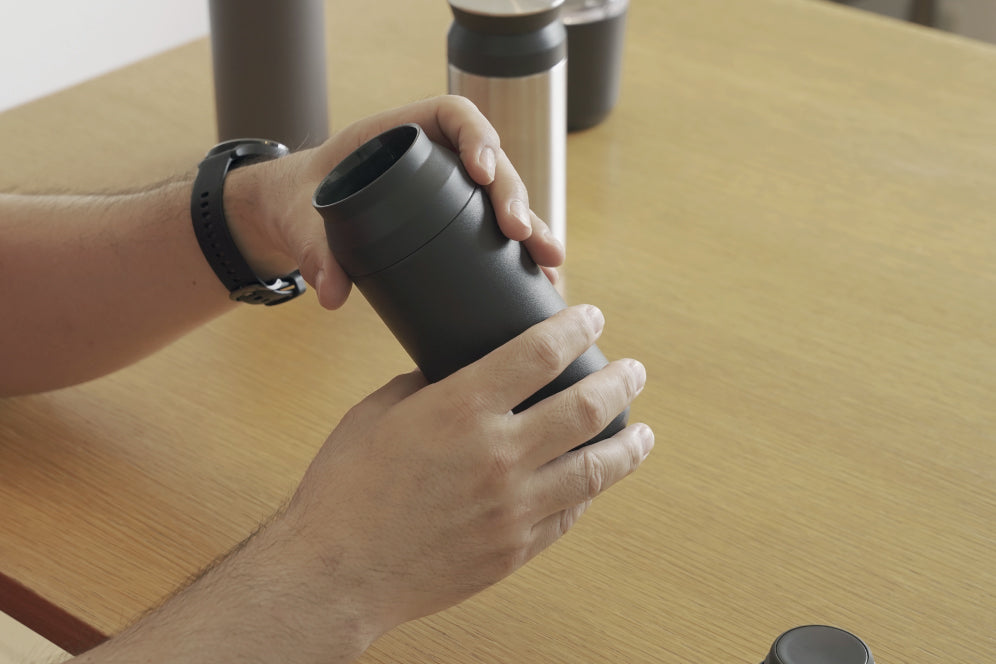
When I work with KINTO I always imagine myself as a user, and try to create something I would personally be excited to own. The tumbler also had to be easy to use, otherwise people wouldn’t want to use it on a daily basis. I believe the whole point of product design is to have people use it – the user experience is the final piece of that completes the design, connecting the user with the product. My ultimate goal is to design products that achieve love at first sight and to have that love grow over time with repeated use. With the TRAVEL TUMBLER I feel like I came very close to that ideal.
Click here for vol.1
DESIGNER PROFILE
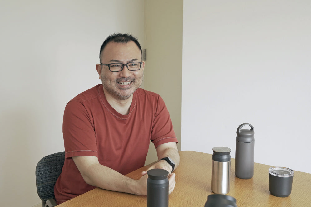
Shin Azumi
Established ‘a studio’ in 2005 in London, UK. His design works include consumer products, furniture, lighting, electronics and audio equipments as well as spatial design for shops, restaurants, and exhibitions. Since 2016, he is taking the professorship at Hosei University, Faculty of Engineering and Design, in Japan.
